![[ANSYS, Inc. Logo]](fluentlogo.gif)


|
|
|
Data can be plotted in XY (abscissa/ordinate) form or histogram form. Each form is described below.
XY Plots
An XY (abscissa/ordinate) plot is a line and/or symbol chart of data. Virtually any defined variable or function is accessible for this type of plot. Furthermore, you may read in an externally-generated data file in order to compare your results with experimental data. You can also use the XY-plot facility to plot out profile data, the residual histories of variables, or the time histories if you have a transient problem.
ANSYS FLUENT provides tools for controlling many aspects of the XY plot, including background color, legend, and axis and curve attributes. Figure 29.9.1 shows a sample XY plot.
To differentiate the data being displayed, you can customize the pattern, color and weight of the data lines and the shape, color, and size of the data markers.
When an XY plot is displayed in the graphics window, you can use any of the mouse buttons to add text annotations to the plot. (See Section 29.2.4 for more information about the mouse-annotate function.) In addition, you can use any of the mouse buttons to move and resize the legend box.
Histograms
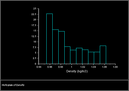
A histogram plot is a bar chart of data. It is a representation of a frequency of distribution by means of rectangles of widths representing class intervals and with areas proportional to the corresponding frequencies. When a histogram plot is displayed in the graphics window, you can use any of the mouse buttons to add text annotations to the plot. (See Section 29.2.4 for more information about the mouse-annotate function.) Figure 29.9.2 shows a sample histogram.
See Section 30.8 for information about printing histogram reports. For more information on histogram plots, see Section 29.9.8.
Previous:
29.9 Histogram and XY