![[ANSYS, Inc. Logo]](fluentlogo.gif)


|
|
|
Histograms can be displayed in a graphics window using a bar chart (or printed in the console window, as described in Section 30.8). The abscissa of the chart is the desired solution quantity and the ordinate is the percentage of the total number of cells.
Steps for Generating Histogram Plots
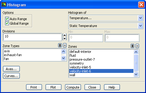
You can create a histogram plot of solution data using the Histogram dialog box (Figure 29.9.12).
 Plots
Plots

 Histogram
 Set Up...
The steps for generating a histogram plot are as follows:
Options for Histogram Plots
Other than the axis and curve attribute controls mentioned in the procedure above, the only option for histogram plotting is the ability to specify a subrange of values to be plotted.
Specifying the Range of Values Plotted
By default, the range of values included in the histogram plot is automatically set to the range of values in the entire domain for the selected variable. If you want to focus in on a smaller range of values, you can restrict the range to be displayed.
To manually set the range of values, turn off the Auto Range option in the Histogram dialog box. The Min and Max fields will become editable, and you can enter the new range of values to be plotted. To show the default range at any time, click the Compute button and the Min and Max fields will be updated.
You can also choose to base the minimum and maximum values on the range of values on the selected surfaces, rather than in the entire domain. To do this, turn off the Global Range option in the Histogram dialog box. The Min and Max values will be updated when you next click Compute.
Previous:
29.9.7 Residual Plots